Lviv Institute of Management
Rebranding project for the the oldest business school on the West of Ukraine
VISUAL RESEARCH
Ukrainian Universities’ marks are mostly too complex and too similar.
International visual practice shows the tendency to simplify the historic emblem but still use it as a symbol of heritage. Also, most logotypes are becoming typography-based.
Lviv city signs and symbols - lion is a well recognizable image.

CONCEPTUALIZATION
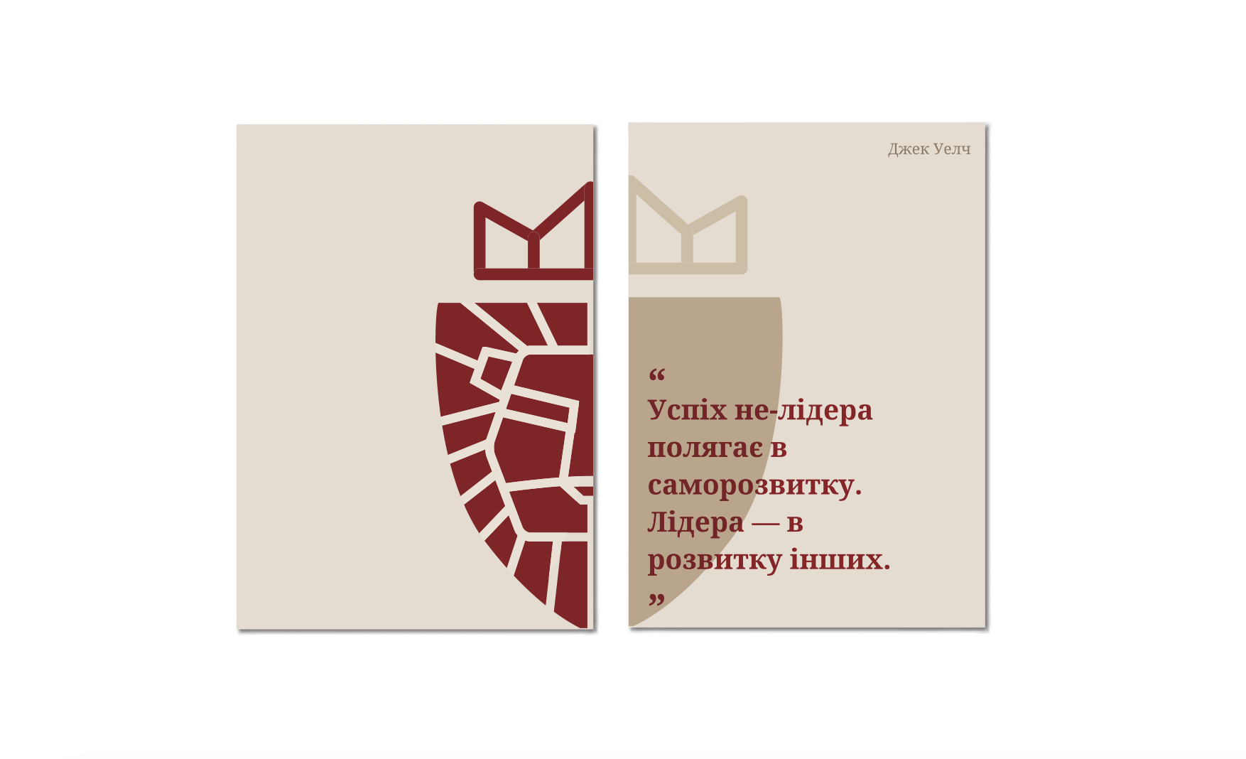
The old logotype was expressing an emblem of Lviv city. While being well-composed, it looked old-fashioned and not flexible.
Route No.1. To revive the old mark by simplifying it based on geometrical shapes.
Route No.2. Modernize the logotype based on the adaptable emblem, build the ‘LIM’ abbreviation brand and create dynamically changing identity - from lion to LIM

BRAND EXTENSION
1. Logotype short and extended versions.
2. Brand visual system for the departments within the institute.
3. Departments’ logotype options depending on the usage - full , shorten and image-based.
4. Branding for the outdoor prints with the usage of brand shape of an emblem. Interaction of the type and image.


Brief. The brief was to revive the image of the oldest and most experienced business school on the West of Ukraine adapting to the web and social media environment but preserving the heritage at the same time.
Target audience. Institute wanted to revive the strong image for the school graduates, their parents, and young professionals looking to upgrade their knowledge. At the same time, it was important to influence other stakeholders’ visions, such as tutors, sponsors, and shareholders.
Solution. During the visits and the discussion process, there was defined the main values, mission, and point of difference of the institute. These allowed to fit the whole brand core within the LIM abbreviation using it both as the institute name and system of values.
Also, it was strategically chosen to reposition the institute with its short name, which is easier to remember. At the same time, it allows saying that institution is well known for decades and traditionally can now be called shortly. As the institute had various departments, there was created the whole color code system to brand each of them as an integral part of the facility.
Effect & Affect. Although rebranding is still in process, there was already planned the relaunching of the website with the new branding, new social media campaign, and design of alumni community page with their success stories and advice. Some institutional departments were decided to be renamed to be more short and catchy. Overall, employers and students were the first to reconsider the brand story, institute essence, and its heritage.